Thursday, November 22, 2012

Complex Simplicity

Bookmark and ShareOne of the things I love to do when I design a lovespoon is to walk the 'Complex Simplicity' tightrope.   For my tastes, my best lovespoons happen when I can marry simple, straightforward lines with a little bit of dazzle and have it all come out in a unified fashion.   There's nothing new in that avenue of artistic exploration, but it never gets any easier to achieve!  That is why I am so pleased with this spoon I carved a couple of months back.  Every time I look at it, I get a feeling of great satisfaction that I managed to make it work exactly as I had hoped it would.   I'm sure that there are legions of art critics out there who will tell me, "I shoulda done this" and "I shoulda done that", but for ME, it works and looks great!   I love the shape of the bowl and the way it kicks back up toward the
handle to form half of an upside down heart shape, the tapering knotwork blends its complicated twists and turns beautifully with the fair curves of the handle and the reverse turn on the crown caps things off really nicely.It looks pretty easy, but believe me, it took a long time on paper before those simple lines looked 'just right'.   A fraction of an inch either way and things became too fat or too thin, too long or too short....now I know why Goldilocks was such a fussy little so-and-so!!Separate from the artistic exploration, I couldn't lose sight of the spoon's purpose...it is, first and formost, a lovespoon.  I wanted a simple heart to send an unambiguous message of love but in a way that didn't render the design 'kitschy' or make the spoon a bit hokey.  I chose to centre the heart at the middle of the top curve and to keep it very clean and straightforward.   It commands the eye, but it doesn't detract from the rest of the design.  I'm happy.

But here is my favourite part of the whole design!   It's probably not the most dramatic or 'in your face' part of the spoon, but I love how everything converges in this one little spot just above the bowl. The lines are all clean but are very dramatic, they create tension but also resolve in a comfortable manner.  OK, maybe not everyone's cup of tea, but I find derive great pleasure from making these simple lines work out!  Even the somewhat brittle birch wood cooperated and let me off without any chipping or tear-out!


Most spooncarvers, and I am no exception, design their spoons to be hung vertically on the wall.   I have found it is always a good idea to look at the spoon from several angles though.  Sometimes, the spoon doesn't look 'quite right' on the wall and it isn't until it is viewed horizontally or from the top down that imbalances appear which hamper the success of the design.  For me, this spoon works equally well hung vertically or horizontally and lets me know that I've managed to balance everything as well as I can.
This might look a simple little spoon, but there's more going on than first meets the eye!!

Sunday, November 4, 2012

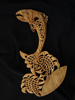
Leaping Salmon

Bookmark and ShareI love doing Celtic knotwork, so when a wonderful commission came my way with no boundaries attached, I really went for it!!
This is a leaping salmon with the splashing of water as it jumps rendered in Celtic knotwork fashion.  Fish are MUCH harder to do than one would think and when you're trying to make them Celtic to boot, they get even tougher!!  I wanted the fish's head to be instantly recognizable as a salmon, so I chose to show it as it would look returning to its spawning grounds, leaping the waterfalls and obstacles which stand in its way.  I took more liberty with the body and tail,using the complex knotwork (which Celtic art has become so well known for) to create the fluid details of its fins and skeletal structure.
The waves and splashes were a completely different problem.  Here I wanted the knotwork to appear fairly formal while still giving the effect of movement and some sense of the 'random' nature of water splashing around.  Not an easy tightrope to balance on, but I think it worked out pretty much as I had hoped it would!
I placed the bowl on a bit of an angle to give it a more 'rocklike' appearance, symbolizing the obstacles the salmon has to overcome on its long journey.  For those of you with eagle eyes, the tiny face beneath the salmon's tail represents an egg and the next generation of salmon to make the perilous voyage from stream to ocean and back to the stream again.
The wood I chose for this carving is a glorious piece of birch which displays the beautiful colours of 'spalting'.  This colouration comes about when the wood begins its long process of decay, rotting back into the soil to become food for the next generation of trees.  As well as lending the piece wonderful movement and colour, the spalting also hints at the cycle of life so aptly illustrated by the salmon.
Lovespoon purists may argue that this spoon isn't a lovespoon because it isn't festooned with the usual hearts and symbols of traditional spoons...I'm going to reply with a well considered, "Bollocks!"
This spoon speaks to tradition, to the ever continuing cycle of life and family and is reverential of the things which make our lives worth living...beauty, simple pleasures, the natural world and love.

So how's THAT for arty farty????
To be really effective, Celtic knotwork needs to be carved from both sides.  That helps give it more depth and creates nice shadows when it's hung on the wall.  So here's a view from the back.  Get a load of that beautiful spalting in the bowl!!  Woooohooo!!